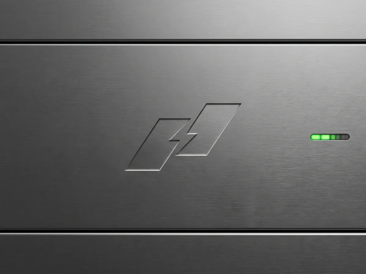
What Nexenergie is
Nexenergie sells forecasting software to energy companies: solar output, power demand and market prices, 48 hours ahead. I designed its new logo. The symbol is 2 slanted blocks with a lightning bolt cut into the gap between them, next to a plain lowercase wordmark. This is how I got there, in the order it happened.
The final lockup.
The brief
Before I drew anything I wrote 3 words: institutional, technical, calm. I asked where the logo would actually live.
- It sits inside other companies’ software. Nexenergie is a layer on top of systems customers already run.
- Energy trading is serious money. The mark can’t look like a toy.
- It has to stand apart from the usual AI startup.
I also wrote down what was out: gradients, glow, anything playful or rounded. The old mark was a blade shape, generic for the category. Not worth keeping. Every project starts like this, with a first call and a brief: step 1 of the 5 steps.
Note: I ruled out looks, not subjects. Lightning stayed on the table.
Exploring wide
I explored 25 marks before I let myself have a favorite. I built them as SVG code with an AI assistant, so changing a corner or a gap took seconds, and I judged each one against the 3 words.
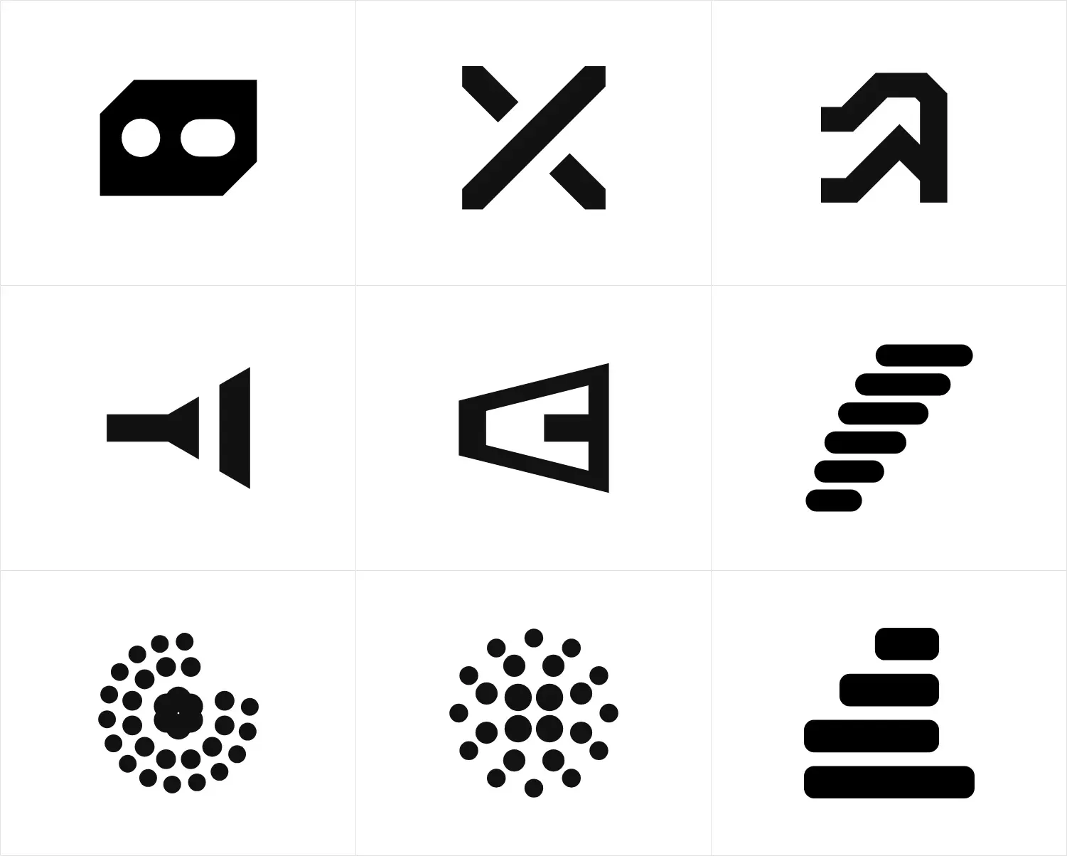
9 of the 25, on white.
9 of them were the same idea: a band that widens, like a forecast range. It made sense on paper. On screen it looked like a flashlight. I dropped the whole family, and that also explained why the set felt generic.
The dot cluster was my first favorite. I liked it before I could explain it, which is the wrong way round. [ASK ANDRII: why did the dot cluster lose, and where did the lightning idea come from?]
Tests before anyone sees it
No mark leaves my desk before 4 tests:
- Squint. Blur it. A clear silhouette has to survive.
- One color, black on white and white on black. Embroidery and engraving have no color to hide behind.
- Small: 64, 32 and 16 px.
- Backgrounds: light, dark and a photo.
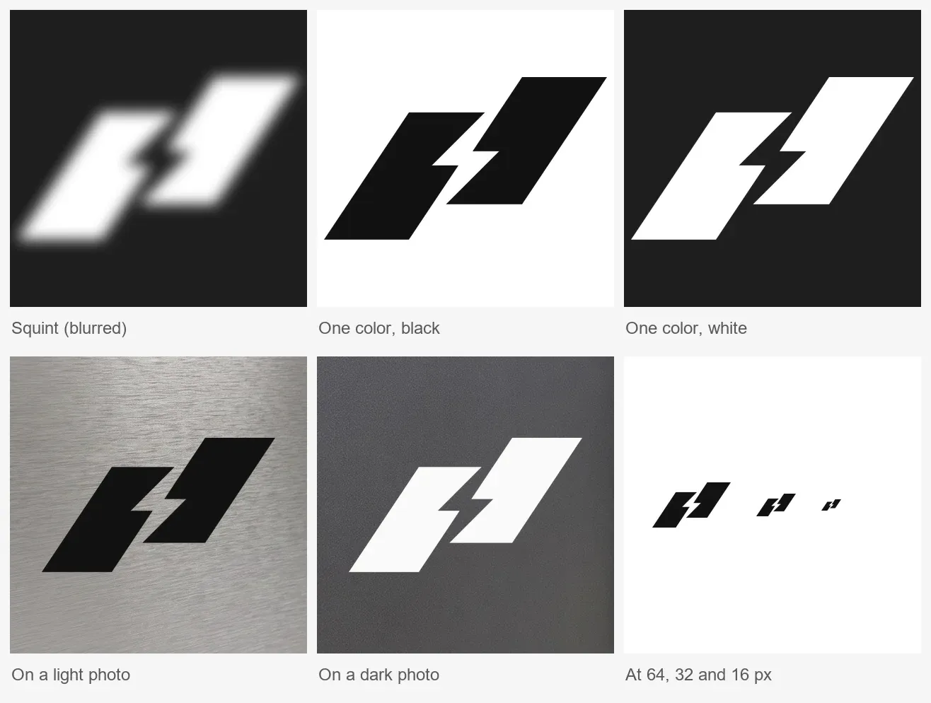
The final symbol through all 4 tests.
It passes, with a catch. At 16 px the bolt closes up and you see 2 blocks. That still reads as the mark. But below 32 px it is a pair of blocks, and a client should hear that from me first.
3 concepts, one pick
I showed 3 concepts: a ring of blades with a condensed wordmark, the 2 blocks with a bolt, and a pure wordmark with a squared-off e. Each went into mockups, because a mark can look good on white and fall apart on a polo shirt.
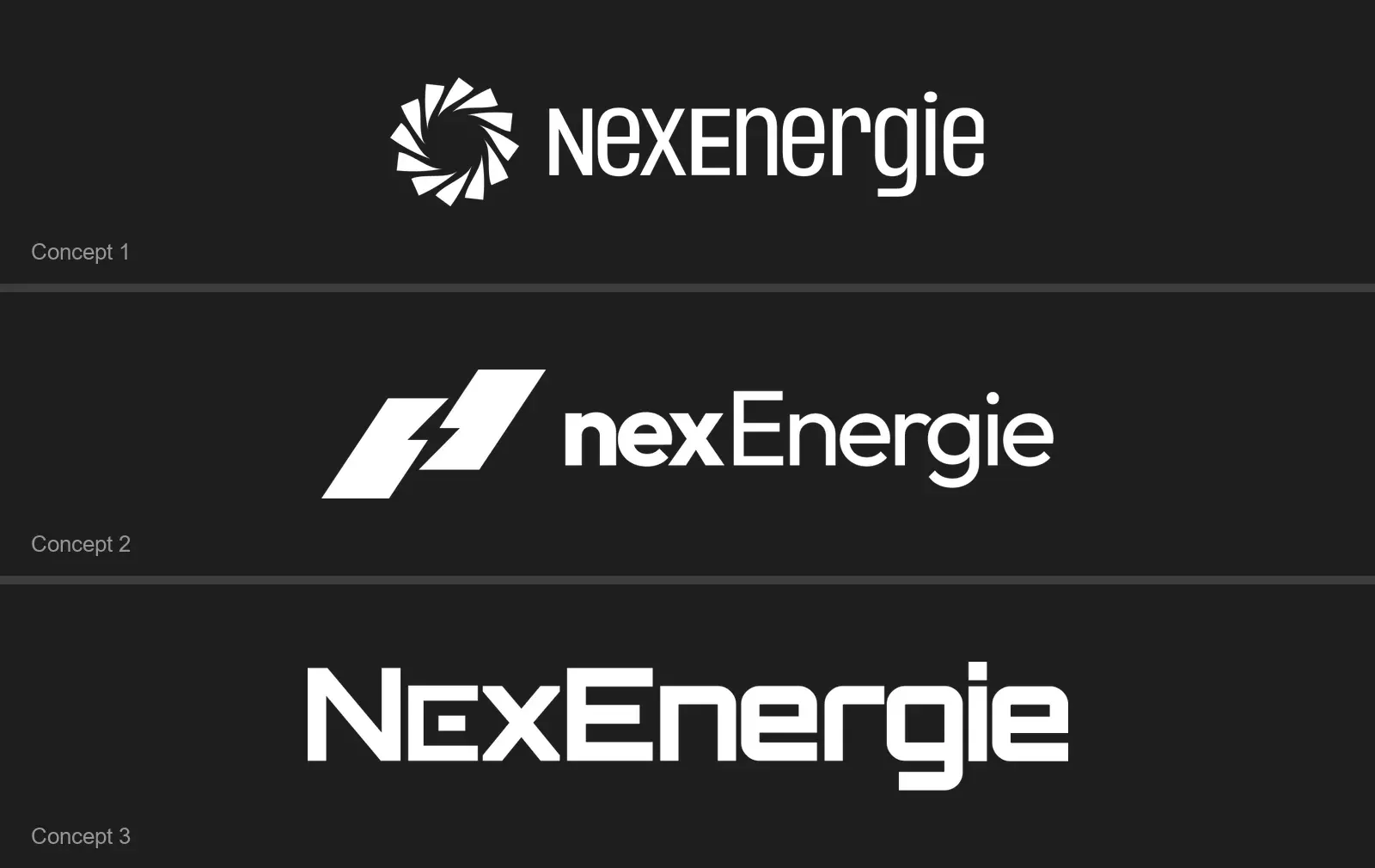
The 3 concepts.
Concept 2 won. In the concept the name was split into 2 weights, bold “nex” and light “Energie”. In the final lockup it is one lowercase word in one weight. [ASK ANDRII: who made the final pick, what decided it, and why the wordmark changed?]
The chosen mark
The 2 blocks share one slant. The bolt is the gap between them, so the symbol is made of empty space, not drawn on top of anything. One flat color, sharp corners, no glow. It stays inside the brief.
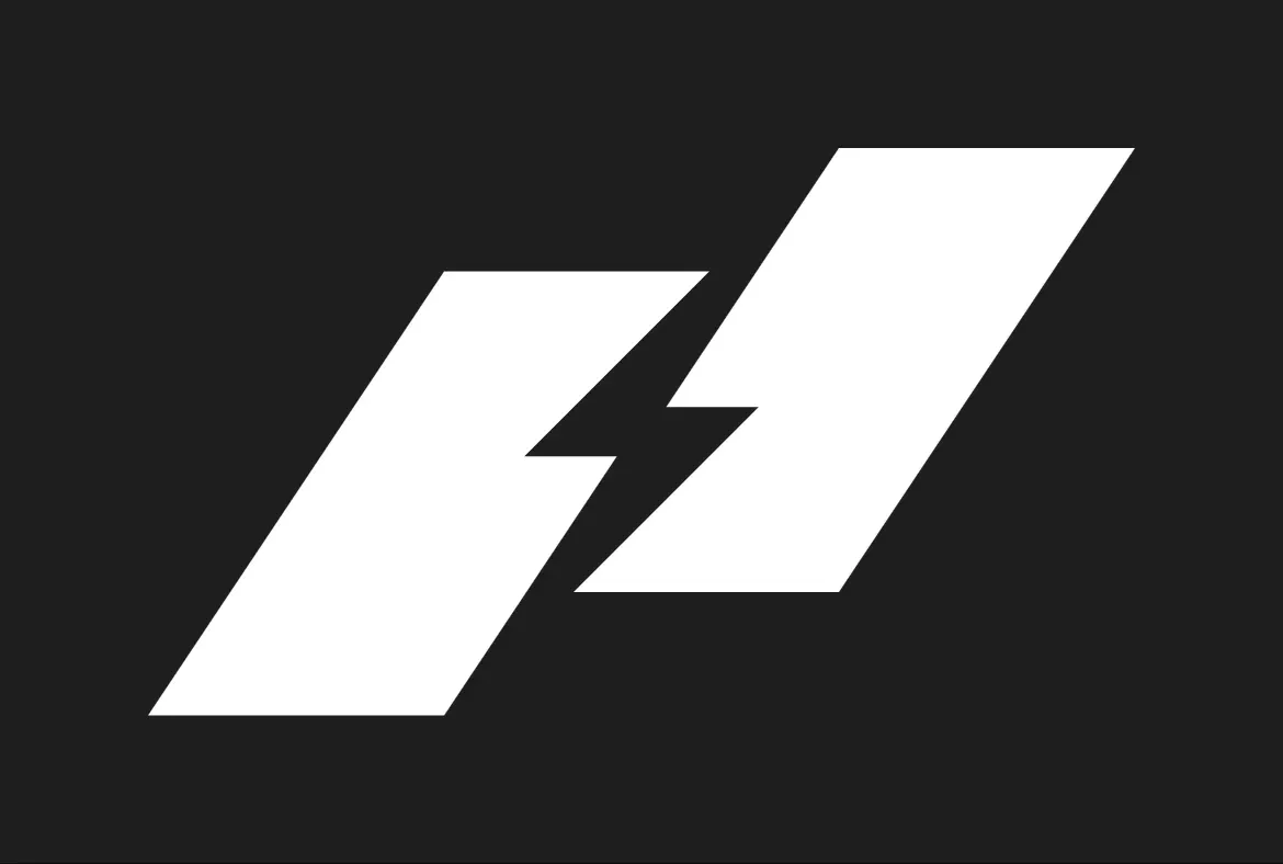
The symbol alone.
The lockup system
A logo is a set of fixed arrangements, not one picture. I built horizontal and stacked lockups, the symbol alone, one-color and inverse versions, and a strip of small sizes. The spacing is locked, so nobody downstream can rearrange it.
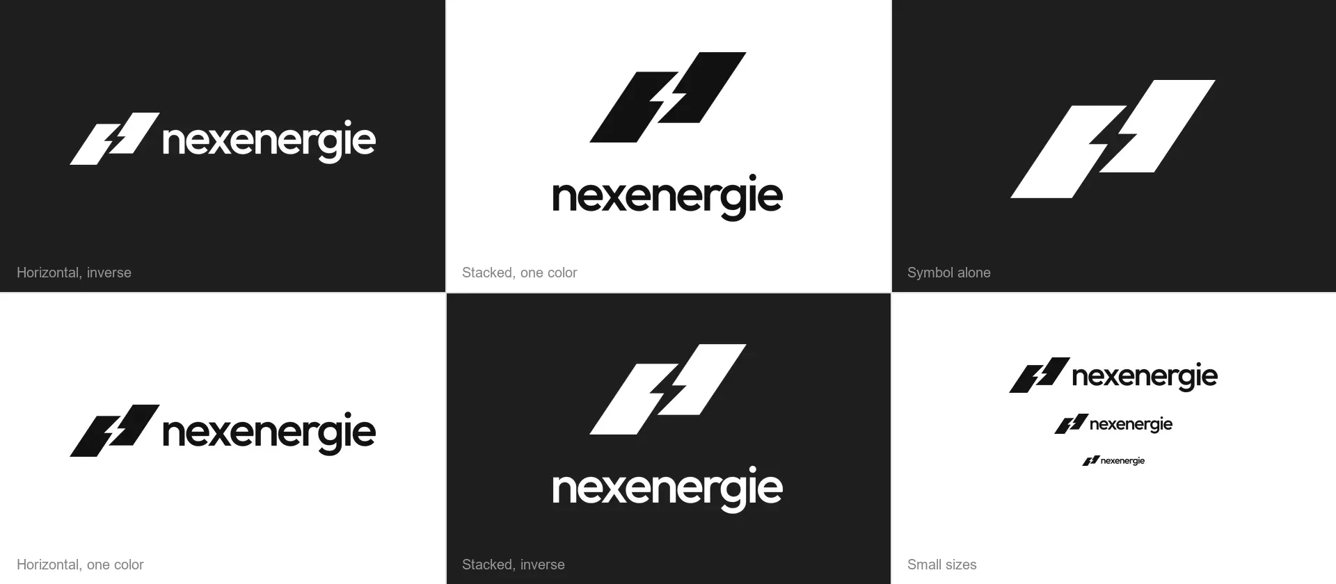
The set, on white and on charcoal.
Note: the symbol alone is for places the full lockup can’t fit, like an etched plate or a polo chest.
The brand in real places
The brief pointed to the places: inside software, on serious equipment. So I tested the mark there. The scenes are generated with Nano Banana through Higgsfield, using my exported logo files as references. The places are generated. The logo in them is my file.
The symbol alone first, on hardware and fabric.
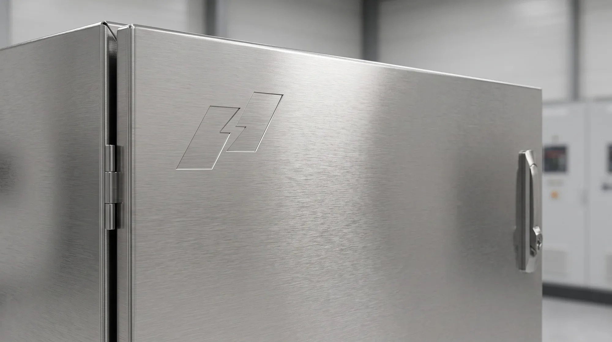
Relief on a switchgear door.
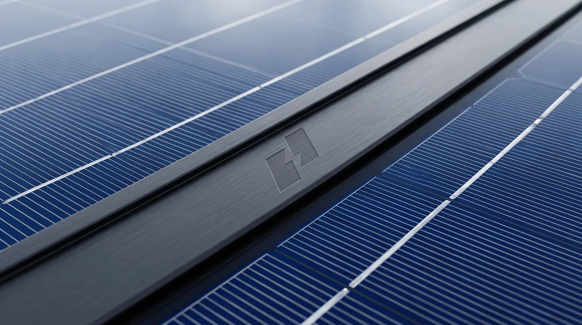
Etched into a solar rail.
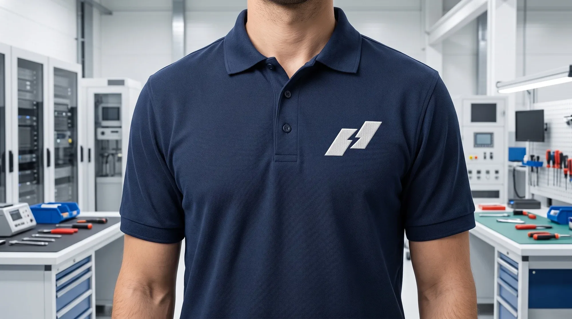
Embroidered on a polo.
Then the full lockup, on paper, steel, walls and a trade-fair stand.
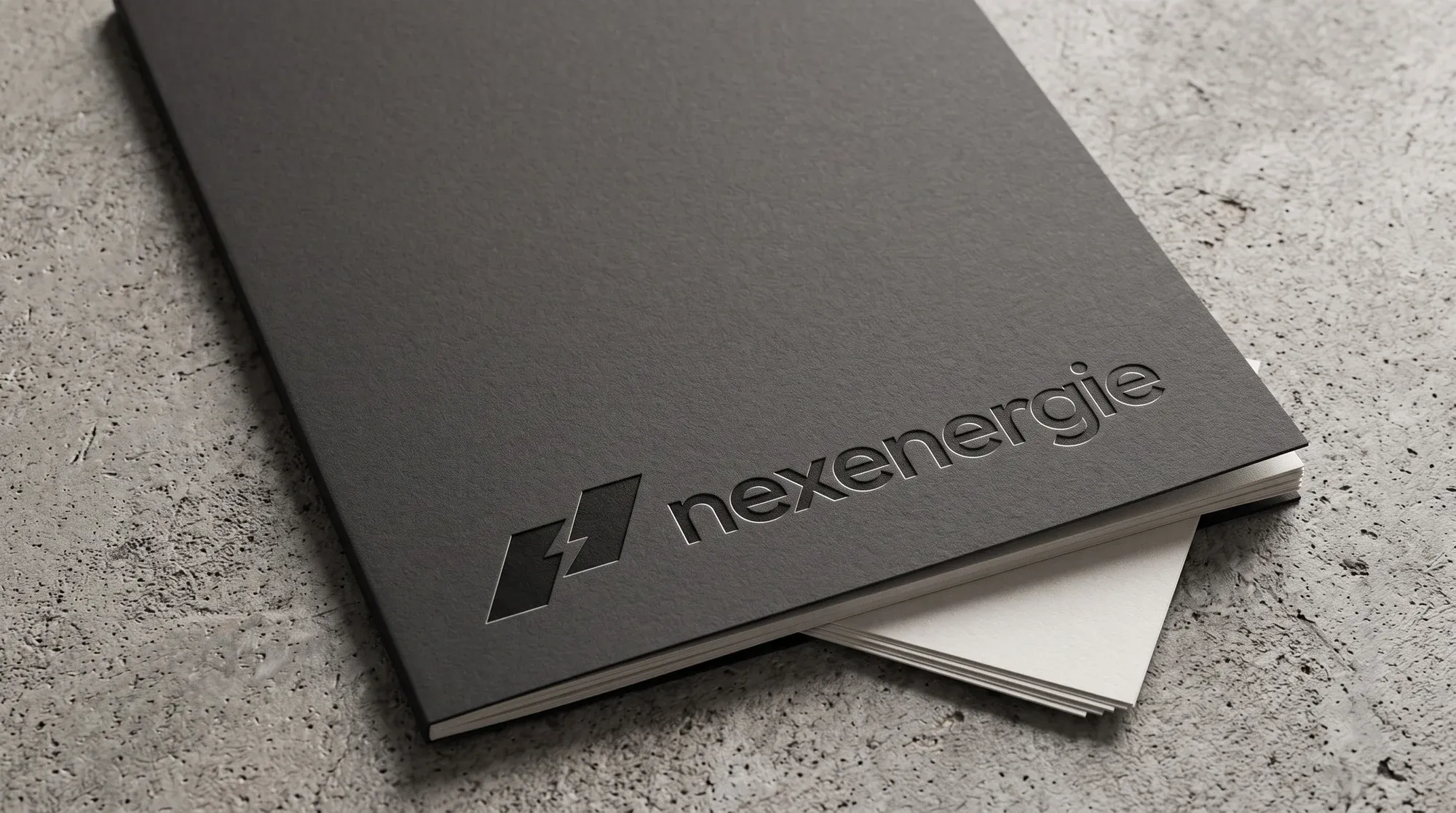
Debossed on a report cover.
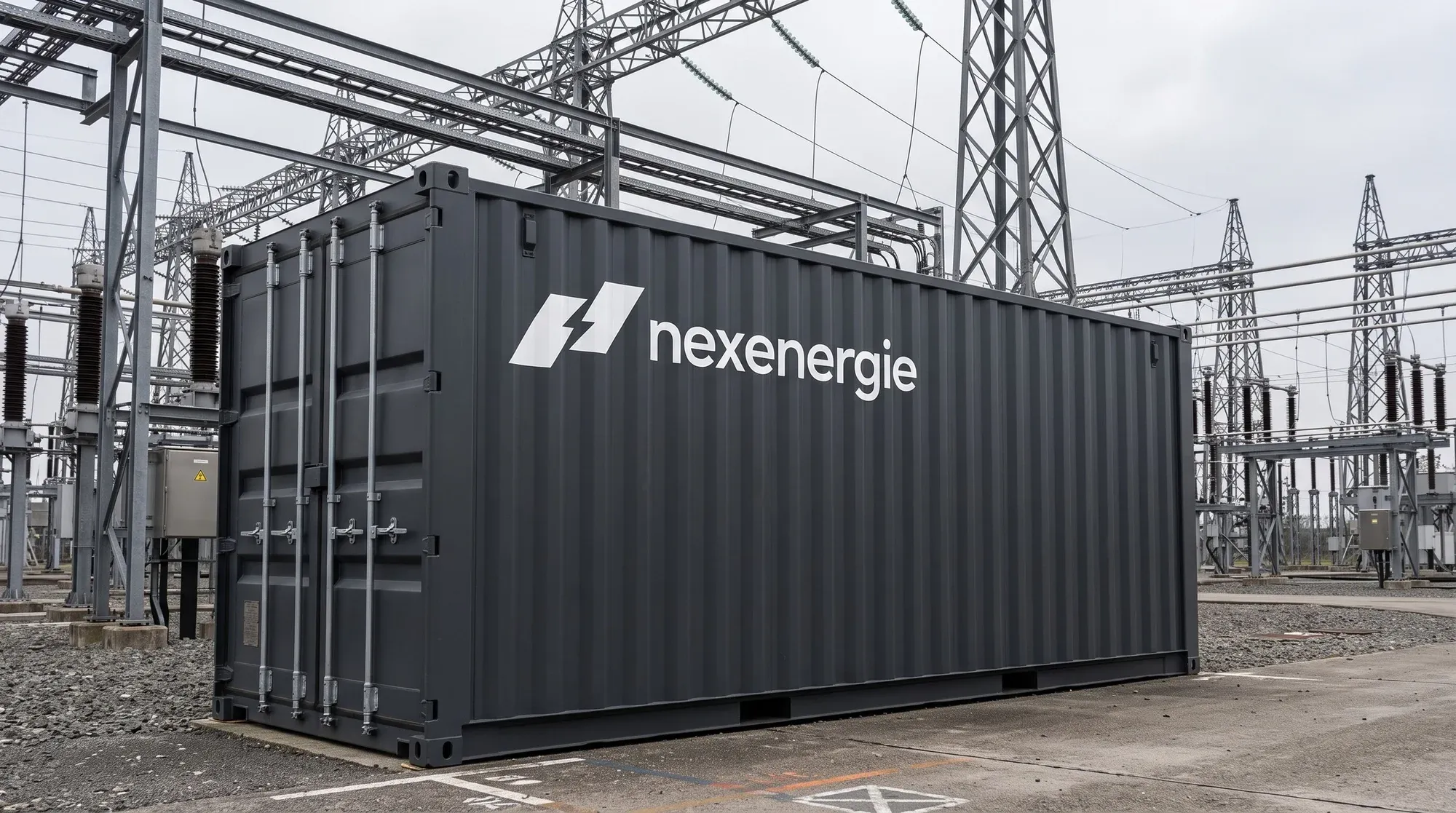
On a container in a substation.
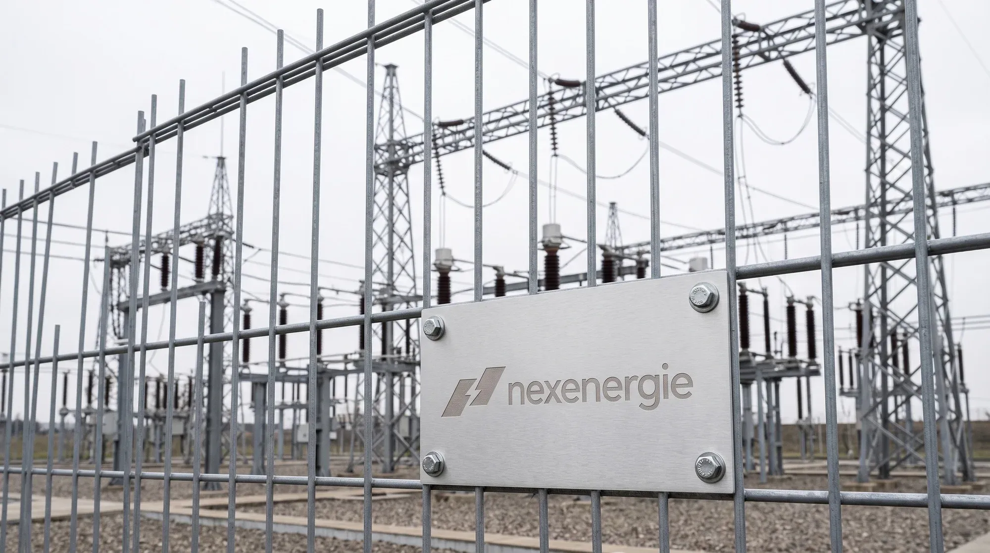
On a plate at the fence.
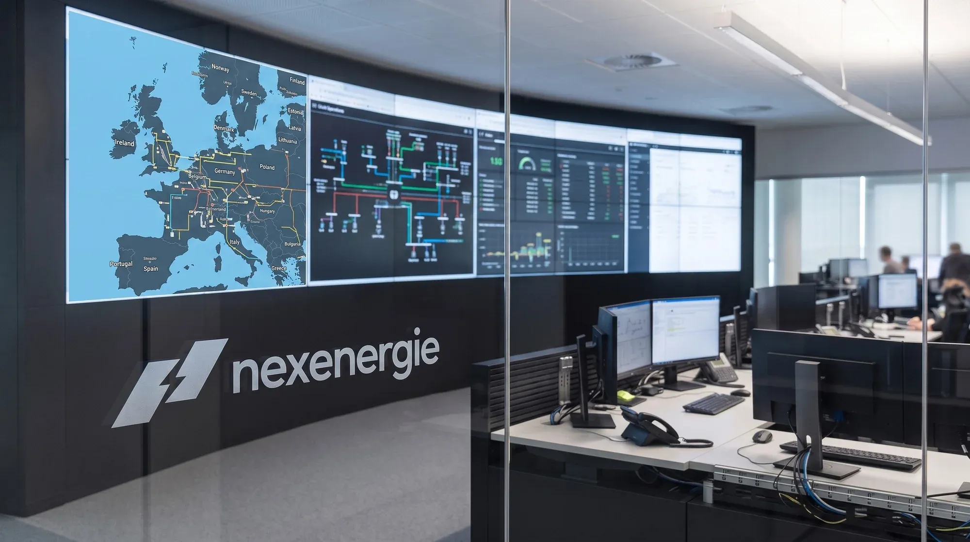
On a control room wall.
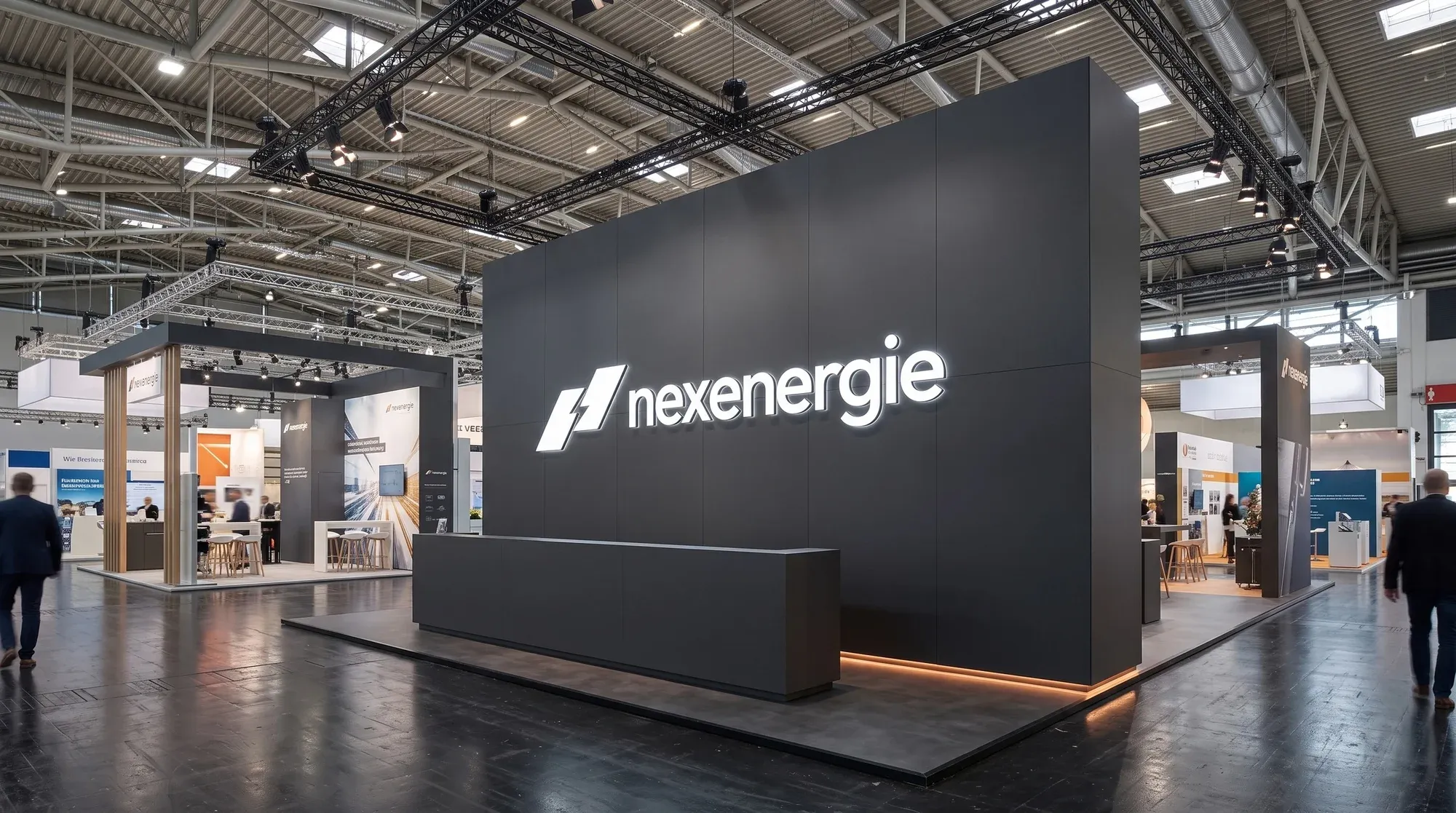
On a trade-fair stand.
What actually changed
The written brief did the most work. With 3 words on the wall, 25 marks were easy to judge, and cutting the widening-band family took one decision, not 9. Writing the rules first also worked on Topdevs, where 5 written rules kept every image on brand.
I would change one thing. I never filled in the audit of the old mark or the written visual system. I made those calls out loud and in a decision log instead. Next time I would write them down, because they are what lets me show a client why a mark was dropped.
There are trade-offs. A bolt is the most common sign in energy, so I took quick recognition over a rare idea. The cut between the blocks is what makes it ours. And the mockups are generated, so real prints and real photos of the mark are still to come.
After the logo, the client sent a list of follow-up work: a LinkedIn banner, an email signature, a business card, a pitch deck and a website. That work is on hold. [ASK ANDRII: has the client put the new logo live, and where?]
Working on something similar? Book a call
