What Topdevs is
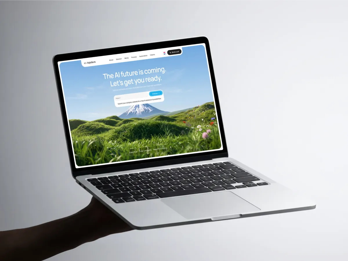
Topdevs is an AI software agency, and I designed its brand and website on my own. The site opens on a calm mountain under a wide sky and asks the visitor for one thing: their company website, for a free AI analysis. The logo, the images and the motion all follow that same quiet idea.
What the site had to do
The brief, as I read it: make the AI future feel calm and approachable. A visitor with an ordinary business should feel ready, not behind.
[ASK ANDRII: who the visitors are, what the old site looked like, and what the agency asked you for. 2 or 3 plain sentences.]
Before any layout, I picked one image to stand for the whole brand.
A single peak and 5 hard rules
I chose a single snow-capped peak. It stands for “the top”, but I wanted it serene, not dramatic. Morning light, clear sky, no storms, no sunsets. Under the peak I kept the ground sharp and detailed: dark rock, lichen, small wildflowers. Skilled hands here, the summit ahead.
Then I wrote the rules down, so every later image would obey them:
- Exactly one mountain. Never a range, never 2 peaks.
- 3 planes of depth: sharp foreground, soft middle, peak and sky.
- A fixed palette: sky blue, meadow green, snow white, basalt gray, small wildflowers.
- Daylight and clear weather only.
- Empty sky stays empty.
Note: the empty sky is a layout rule, not decoration. The headline needs somewhere to sit.
The flag on the peak, and the same mountain world carried into the process cards.
Making the images with AI
I make the images in Nano Banana, an AI image generator, and I treat it like a photographer I have to brief very tightly. The hardest image was the logo: the code brackets from the logo, grown from living vines instead of pasted on as a flat shape. My log for that image alone runs to 13 rounds.
Here is what finally worked:
- Give each reference image one strict role. The logo is a shape guide only. A botanical photo is for quality and light only. Without roles, the model pasted the flat logo or copied the photo’s flowers.
- Name what must not appear. A reference kept dragging in purple morning glory, so I banned it in the prompt.
- Edit small, then start fresh. Editing the best result worked for a pass or 2. Every pass re-renders the whole image, so quality slowly decayed. My final method: a new generation with the best result as the style reference and the logo as the shape reference. I ran it 3 or 4 times at 2K and picked the winner.
- Upscale outside the tool. Its own 4K looked waxy, so I iterate at 1K to 2K and upscale only the final.
Note: a prompt was blocked by the image filter, a false alarm: “grass”, “stems” and “woody” together read like drug slang. My safe rewrite used “willow” and passed, but the result was dry brown wicker. Going back to “living green vines” fixed the look.
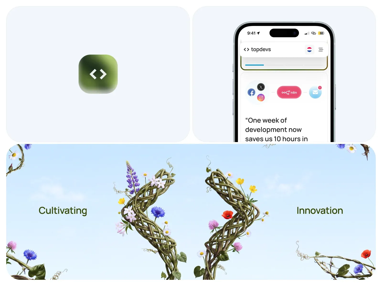
The identity shot: the app icon, a mobile screen and the brackets grown from the bottom edge.
The hero and the free analysis
The headline reads “The AI future is coming. Let’s get you ready.” It sits in the open sky, above the peak, with one plain line under it about tailored software for your business workflows.
The main action is a URL field with an Analyze button. Paste your company website and you get a free AI analysis of possibilities. It costs the visitor nothing, and it is a smaller step than a sales call. “Book a call” stays in the navigation, in dark, so it never competes with the blue Analyze button.
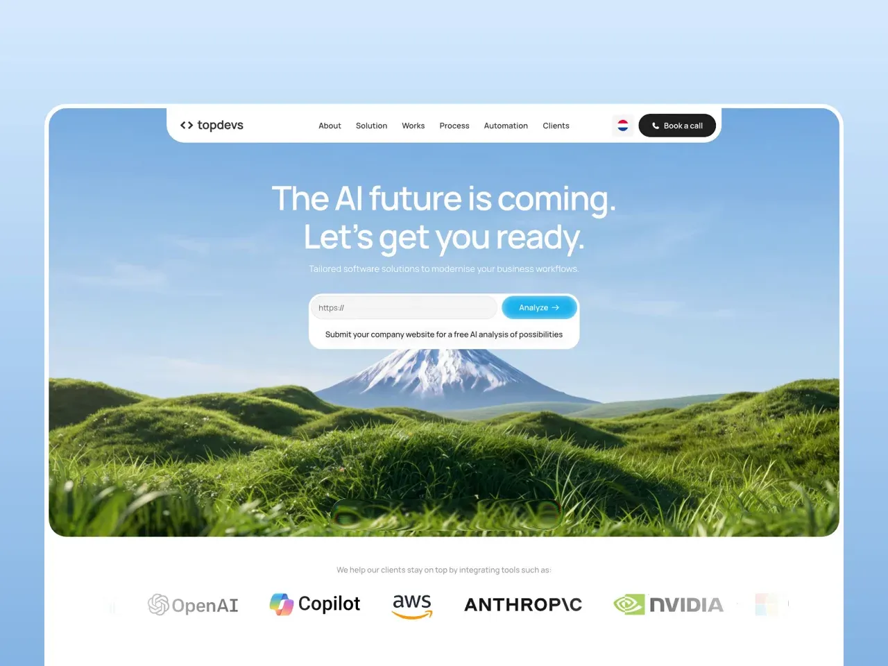
Headline in the sky, the free analysis field under it, the peak behind.
Building trust below the hero
A small strip at the bottom of the hero says “Fixed Price, Code Ownership, Rapid Prototyping”. Further down, a section answers worries with promises, one pair per row. “Fixed price, always transparent” answers hourly billing. “Hosting optional, ownership guaranteed” answers being locked in. Under the hero, a row of tool logos (OpenAI, Copilot, AWS, Anthropic, NVIDIA) shows what the agency works with.
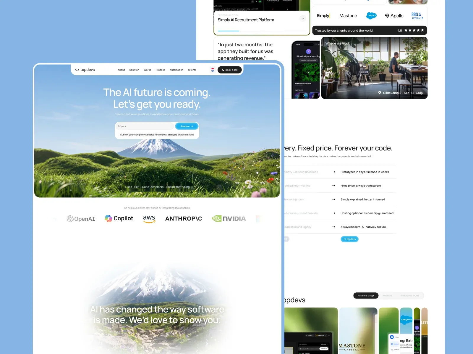
The page below the hero: logos, the fixed price section, work by category.
Mobile
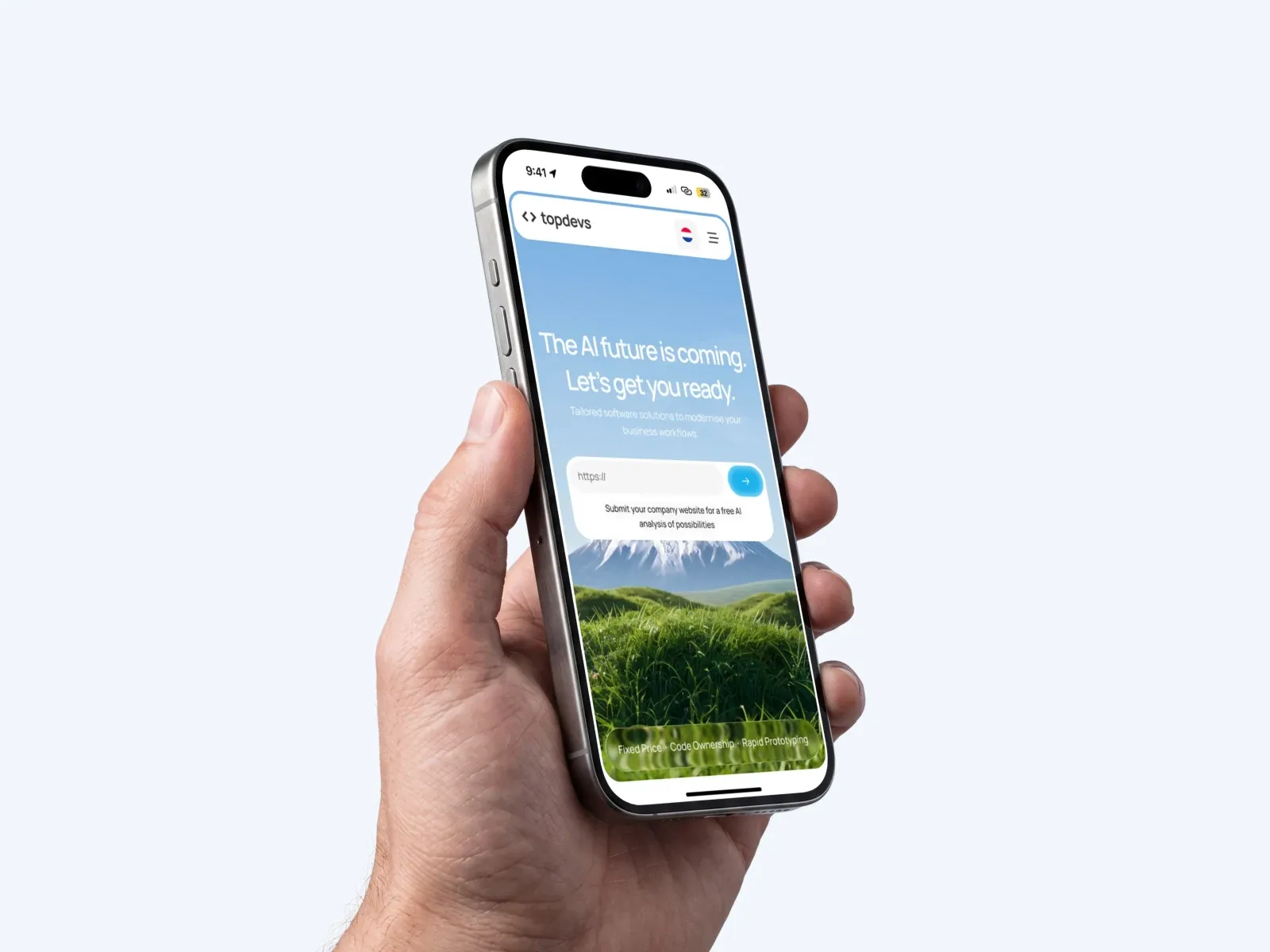
On the phone the page keeps the same order. The navigation shrinks to the logo, a language flag and a menu. The Analyze button becomes an arrow, so the field keeps its width. The form card now covers the base of the peak, but the snow cap stays visible, so it still reads as the same mountain.
The hand and phone in this shot started as an AI image with a blank white screen, and I put the real Figma screen on top.
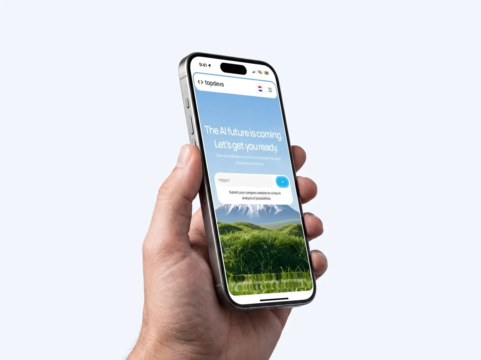
The mobile hero: the form over the peak, the trust strip at the bottom.
Motion
The mountain world carries into the page, so it moves too. These are stills from my motion shots: the flag planted on the peak with snow blowing off it, the process cards with pieces of real rock tucked under them, and the dark rock ridge at the foot of the page, with wildflowers on it.
[ASK ANDRII: what the blooming rock does in motion, what triggers it and how long it takes. 1 or 2 sentences.]
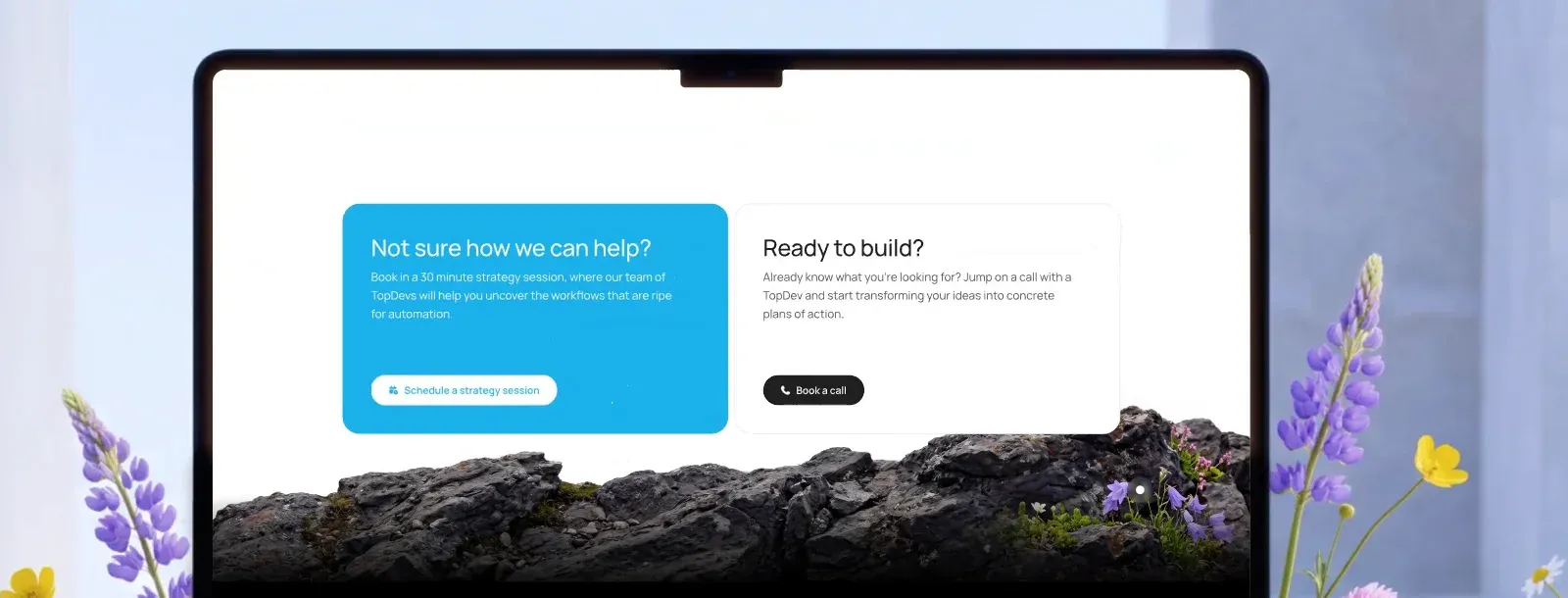
The foot of the page: 2 calls to action standing on the rock ridge.
What actually changed
What worked: the written rules. Once the 5 rules existed, every image matched without me re-explaining the brand. The same habit of writing the rules first shaped the Nexenergie logo. The AI work only became reliable when I stopped asking for one big result and started giving strict roles and small steps. And the free analysis gives a visitor a first step that is not a sales call.
What I’d change: the white headline sits on pale sky, and the small line under it is light on light. I would test the contrast on a real screen and darken the top of the sky a little.
The trade-offs: one mountain keeps the brand tight, and it also limits variety. External upscaling adds a step to every image. And asking for a company website before any conversation asks for trust early, which is why “Book a call” stays one click away. Every project starts with that first call: it is step 1 of the 5 steps.
[ASK ANDRII: did the site launch, and is there any real result (bookings, feedback from the client)? If not, delete this line.]
Working on something similar? Book a call
