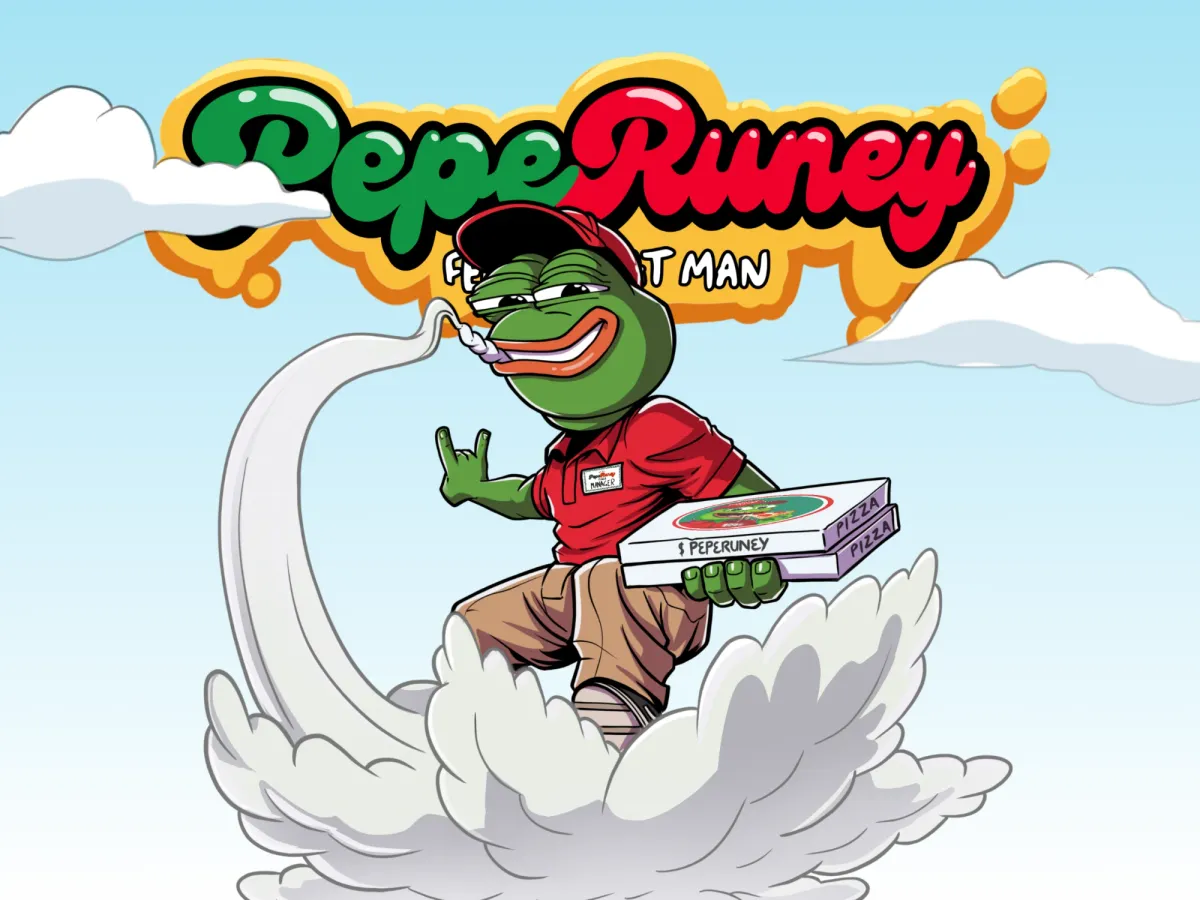
What PepeRuney is
PepeRuney is a meme coin with a character: a green frog who runs a pizza joint, and whose story goes from broke degen to pizza boss. I redesigned its website as an illustrated landing page with scroll-based animations. The goal was a page that stands out and converts in the Web3 space, and keeps its humor.
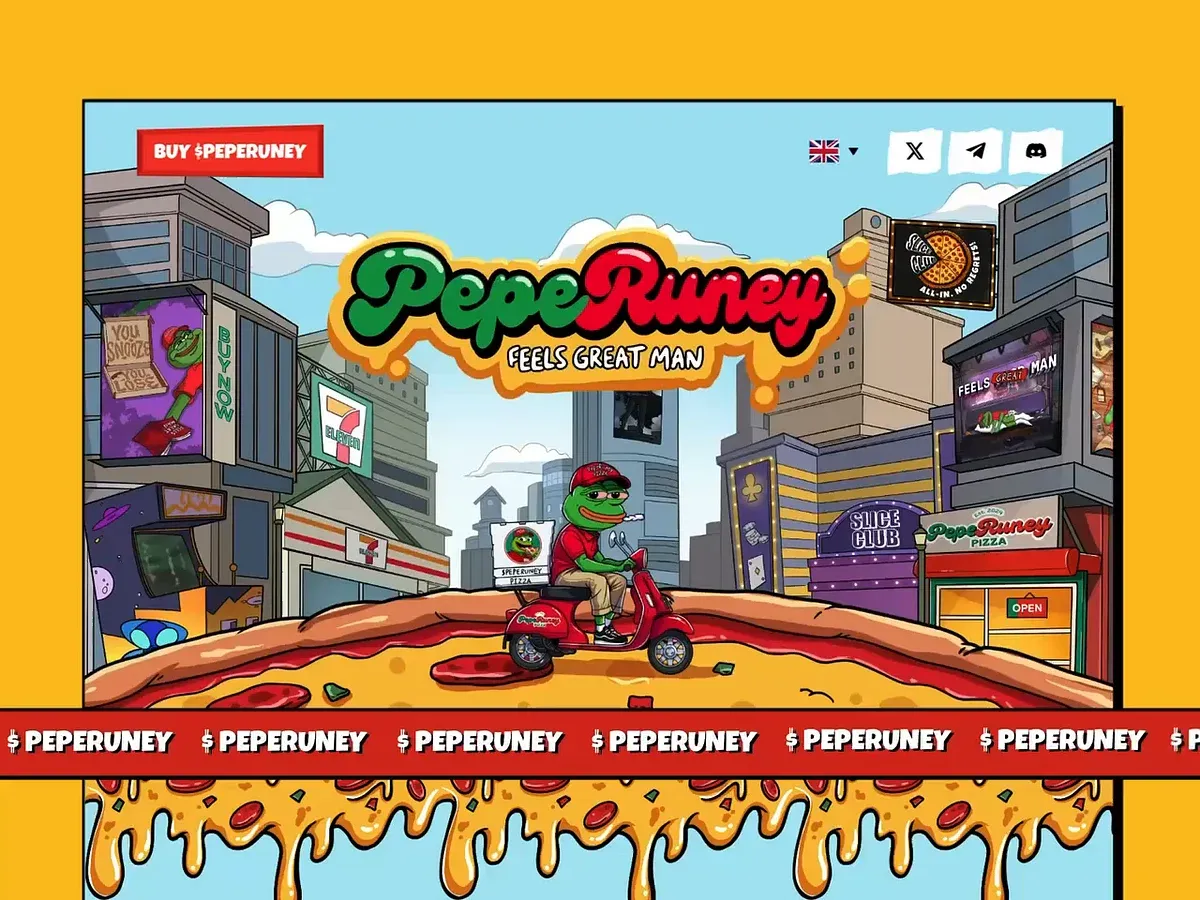
The hero: the frog delivers pizza across a city, under the logo.
The problem
A meme coin lives on personality. The old site was a cream page with the character beside the text. The brief, as my project board puts it, was to keep the personality of the character and show his habits, his hustle and the chaotic charm that make him more than another meme character. The page also had to guide visitors to buy.
My role
I did the art direction, the character and illustration work, the brand and the website design. I published the project on Behance in July 2025.
What I designed
- The character. A sheet that fixes his look: a green frog with a human build, a red baseball cap that reads “PEPERUNEY PIZZA”, a red polo with a “PepeRuney Manager” badge, and khaki pants. A second board lists his personality, from super chill to creative hustler.
- The brand. The logo in a few versions, with a melted cheese drip around the name.
- The website. A hero, then the story of the character, “How to buy” in 3 steps (get a wallet ready, fund it, grab the coin), a token section called Pizzanomics, a click-to-earn arcade, a meme gallery, partners and a community call to action.
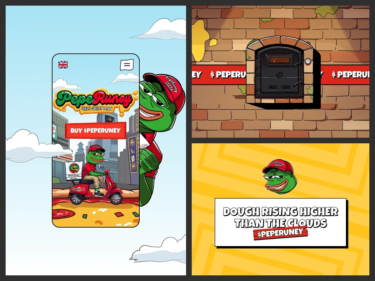
The mobile screen, and 2 of the scenes around it.
Design decisions
- Scenes, not sections. The page moves between a pizza kitchen, a city street and an arcade, so it reads like a place, not a template.
- A tight palette. Red, yellow and green carry the brand (the cap, the cheese, the frog) against a sky blue background.
- Serious parts in plain words. The buying steps and the token details sit in short blocks with simple titles, so the jokes do not hide what a visitor has to do.
Outcome
The project board shows the old site and the new one side by side, with one caption: everything changed except the attitude.
The full project
Every screen and the character boards are on Behance. Tools: Figma, Adobe Illustrator, Adobe Photoshop and an iPad Pro.
Working on something similar? Book a call
