What Simply is
Simply is an AI recruiting platform. It records a recruiter’s meetings, writes the summary, and answers questions about any past call. I was the only designer. I built the brand, the marketing site, the recruiter dashboard, the AI meeting analysis and a design system with 80+ components, 200+ screens in all. Recruiters reported 80% fewer administrative tasks (that is the client’s figure, not mine). Below is how I got every surface to look and work like one product.
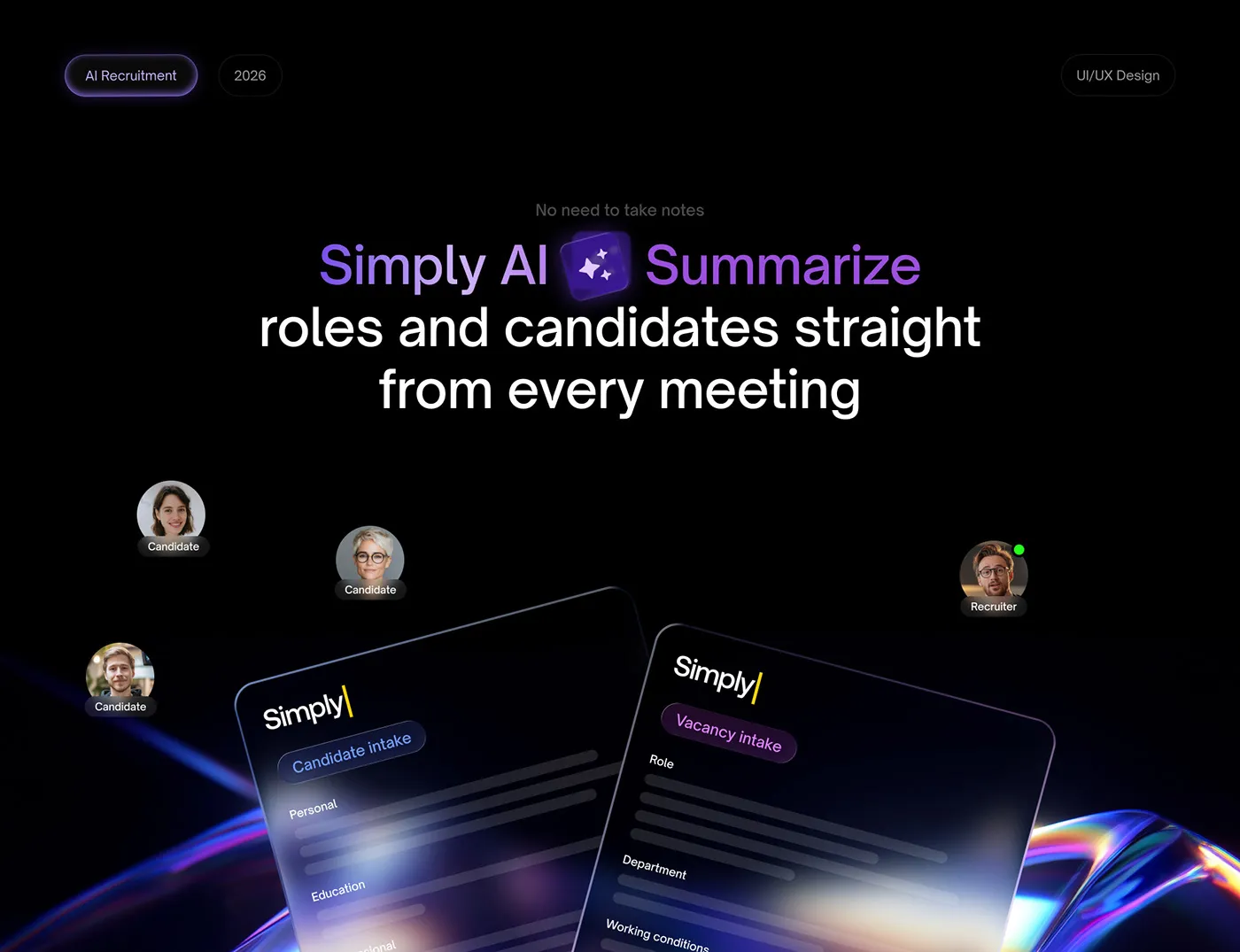
The hero board from the project presentation.
Research before screens
I started with 10 days of research, before any screen. The question was simple: what does a recruiter actually do between 2 calls? [ASK ANDRII: 1 or 2 plain sentences on how you ran the research (who you talked to, what you looked at) and the single most useful thing it showed you.]
What I took out of it was short. Recruiters lose their day to admin, so every screen has to remove a step, not add one. I used that as the test for every decision after it.
A plan the client could read
Then I put the plan on one page, with day counts. Research took 10 days, branding 25, UI/UX 120 and handoff 6. Development took 70 and A/B testing 25, after handoff, with the developers. Client projects follow the 5 steps, from the first call to launch.
UI/UX is the longest bar because the dashboard, the AI analysis and the design system all live inside it.
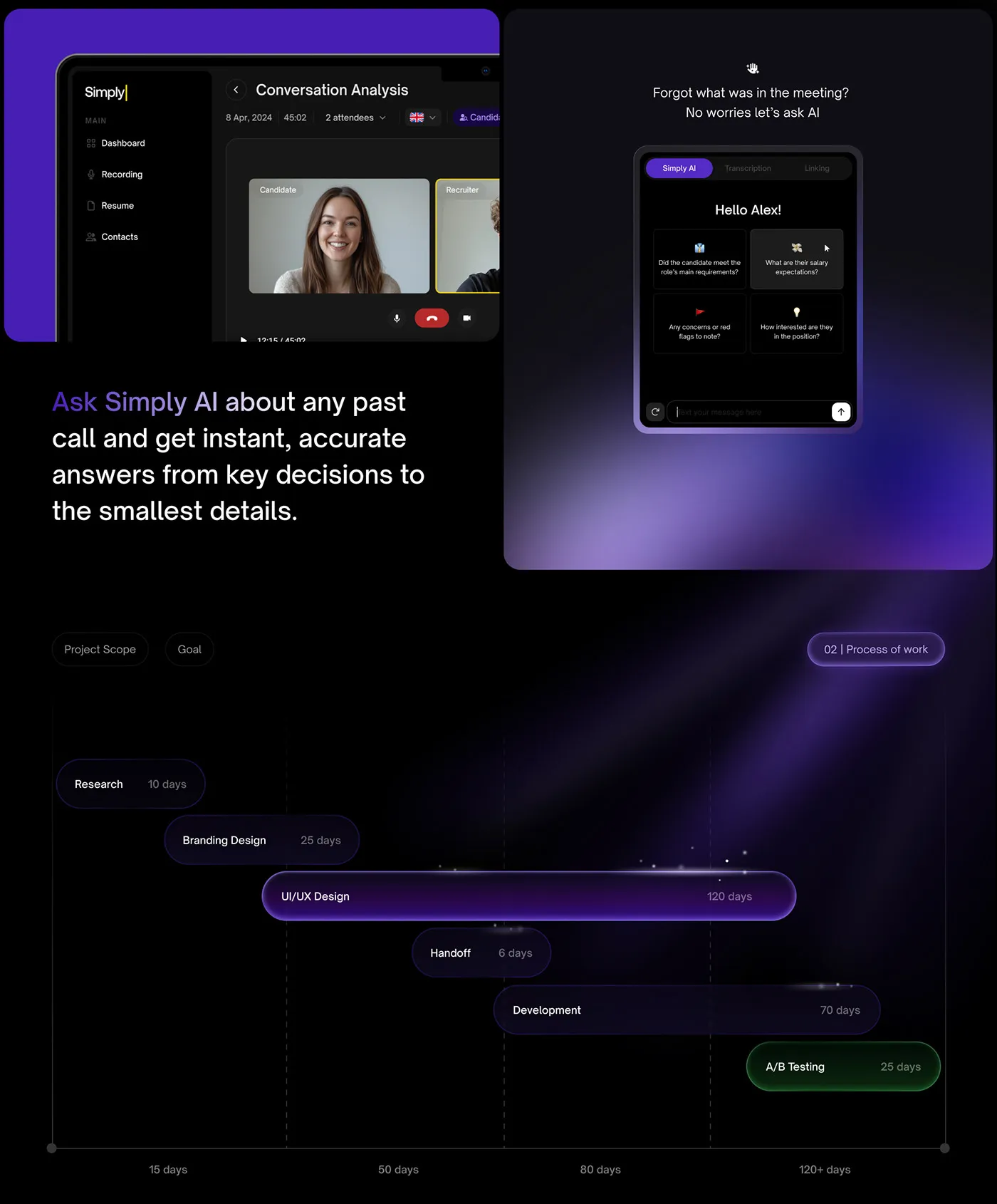
The timeline (lower half) and the AI chat panel (upper half).
Note: I show the plan with numbers instead of stage names. A client reads “120 days” faster than “UI/UX”.
Brand and website
Branding came next, 25 days. The product had no identity to build on, so I made one: purple on black, glass-like cards, and a logo that ends in a small yellow text cursor.
The website carries the same look. The hero says “Find the right candidate. Automate your admin.” and has one main button, Request Demo.
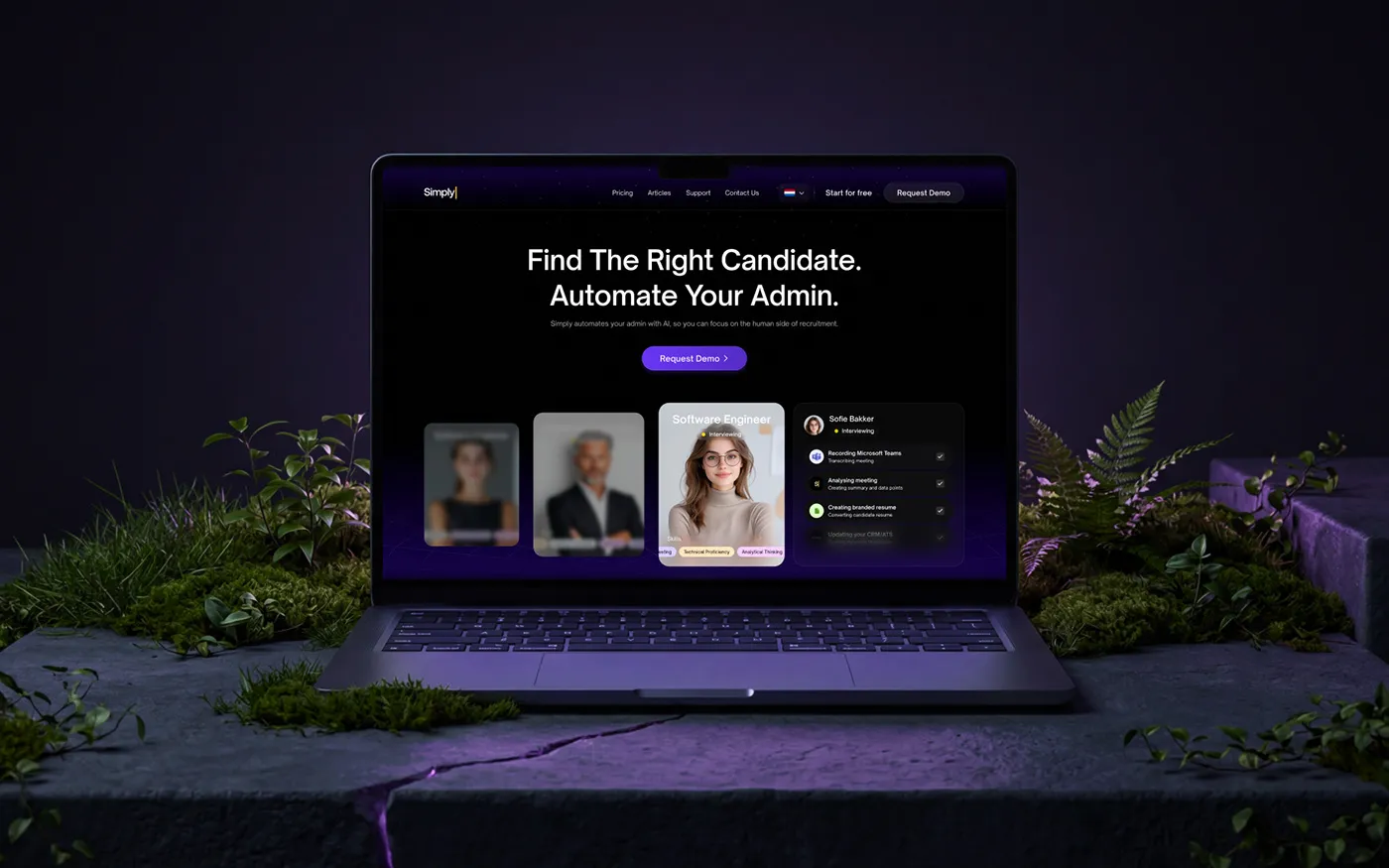
The landing page hero.
The pricing page has 4 plans (Starter, Pro, Business, Enterprise) and a yearly and monthly switch. The Resume Converter is sold on its own, at 8 euros a month.
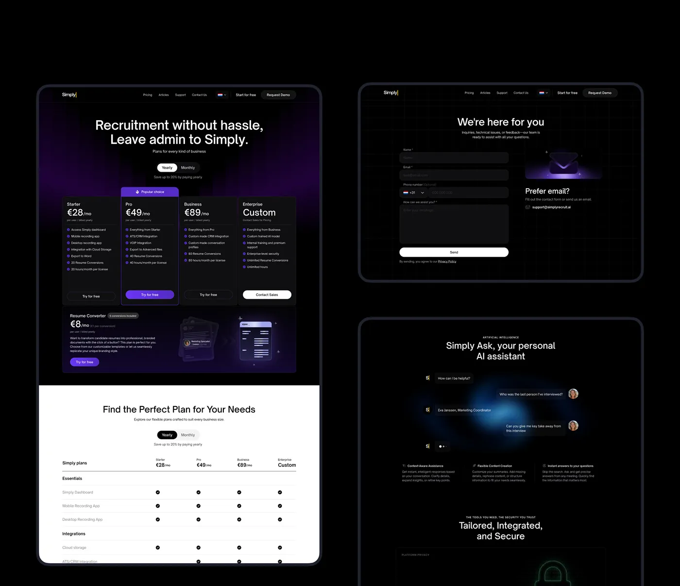
Pricing, contact and the AI assistant section.
The dashboard
I rebuilt the dashboard from scratch: flow, readability, hierarchy. A recruiter jumps between candidates, roles and calls all day, so the menu and the top bar stay where they are and only the middle changes. [ASK ANDRII: confirm “speed over density” came from your own interviews, and say who you talked to.]
The home screen has 3 jobs. A checklist card (1/5 steps done) walks a new user through setup. A row of counters shows 18 completed, 3 reviewing and 5 unprocessed meetings. 2 tables sit under them, one for meetings waiting for review and one for completed ones, with status chips in orange and green.
A card on the home screen opens the Resume Converter. One click turns a candidate’s CV into a branded document. The client reports 10,000+ CVs converted.
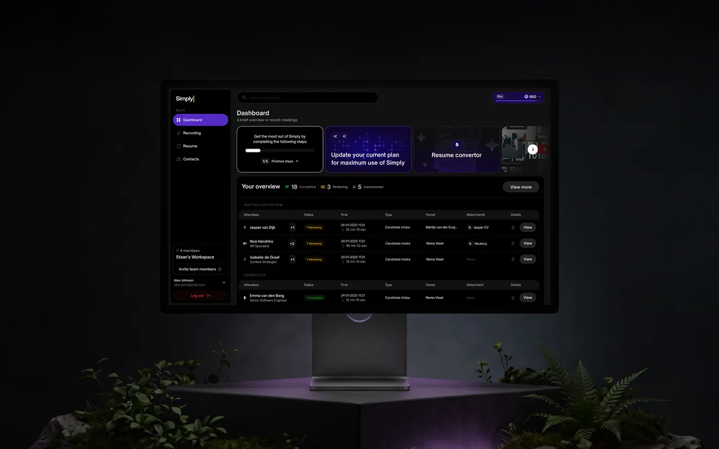
Dashboard home: setup, counters, the review queue.
Analyzing a meeting
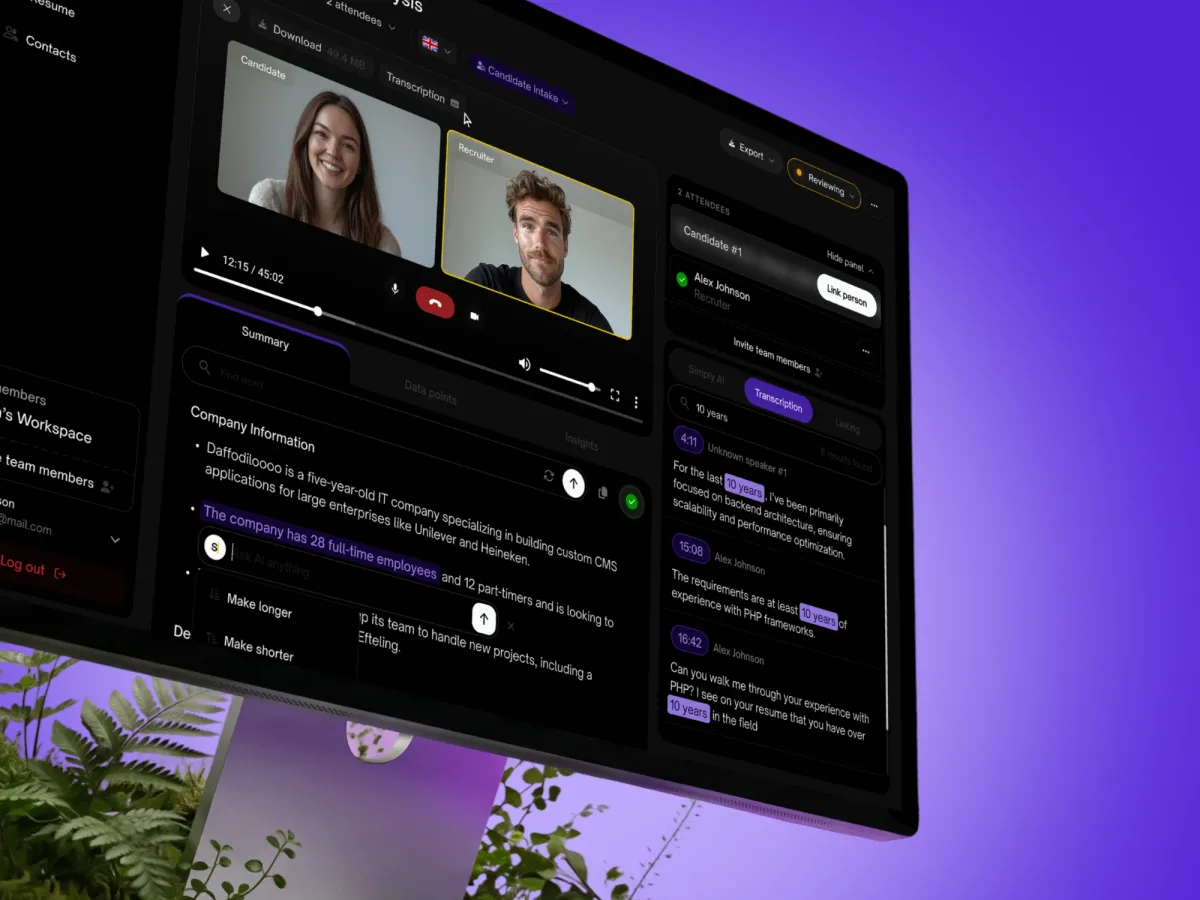
The AI writes text here, and a recruiter has to trust it. So the audio waveform sits above the summary. A recruiter can check any line against the call.
Every meeting also has a status. It stays at “Reviewing” until a person has looked at it, and only then becomes “Completed”. The AI does the first draft, and the recruiter keeps the last word.
Note: the AI chat opens with 4 ready questions, like “Any concerns or red flags to note?”. Nobody has to start from an empty text box.
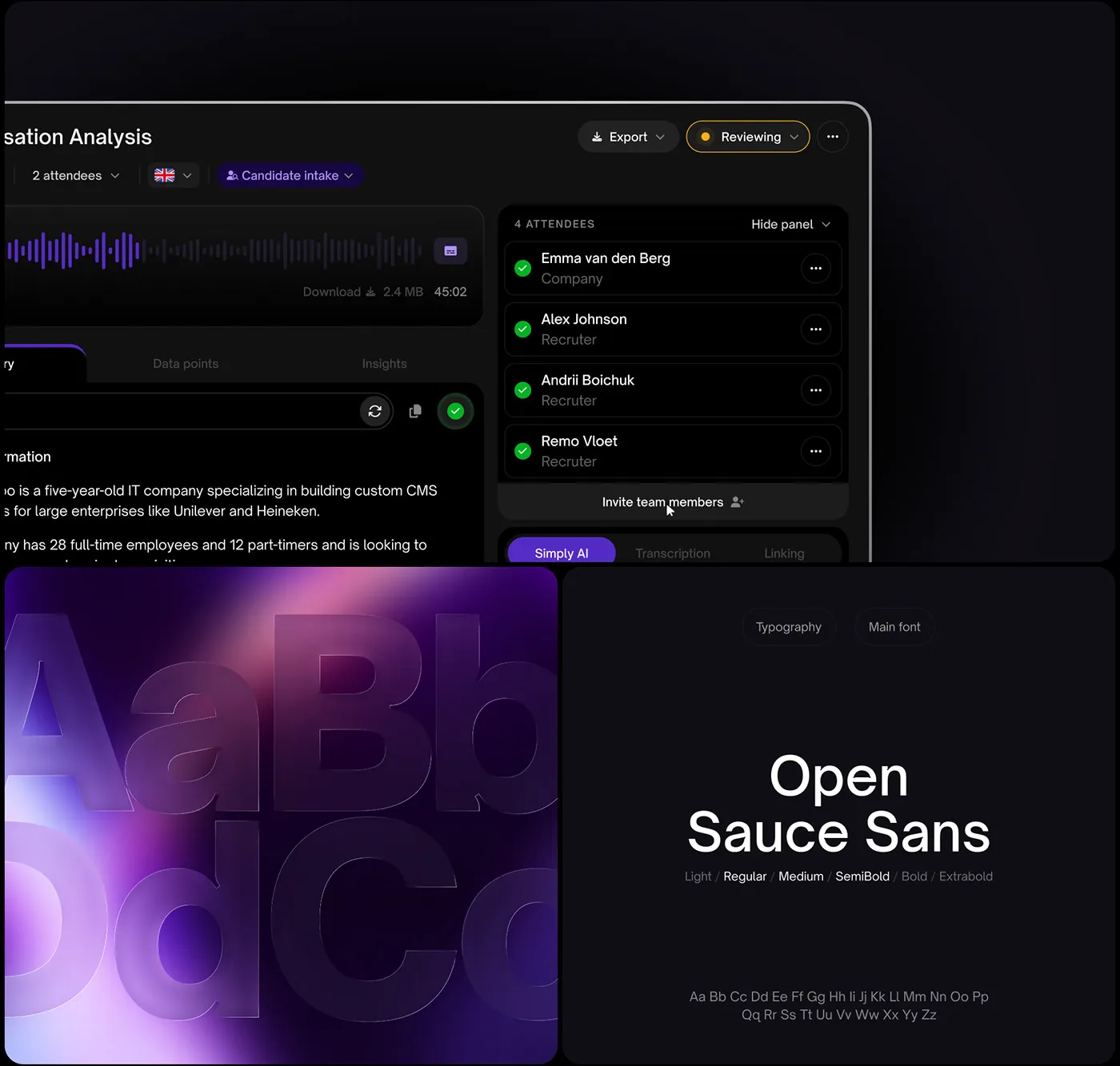
Meeting analysis (top) and the type specimen (bottom).
One system under all of it
I built the system alongside the screens: components, colors, type and spacing. It ended at 80+ components. The type is Open Sauce Sans, shown in the picture above. For a smaller system built around one glass orb, see MindNet.
At the end came 6 days of handoff. I gave the developers the library, ran visual QA on what they built, and wrote short briefs for micro-interactions and motion. Simply also has desktop and mobile apps for recording meetings. [ASK ANDRII: screens of the mobile and desktop capture apps, there is no picture of them in the folder.]
What actually changed
The product now reads as one thing, from the first page of the website to the last screen of the dashboard. The founder, Remo Vloet, wrote: “Andrii is an exceptional designer who consistently goes above and beyond.” The project took 400+ hours.
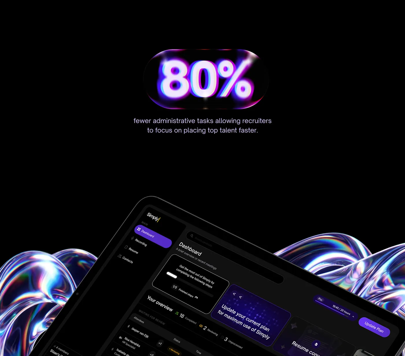
The headline result, as the client reported it.
The trade-off of working solo is real. One designer keeps 200+ screens consistent without a fight, but nobody else reviews the work. [ASK ANDRII: 1 thing you would do differently on this project, in your own words.]
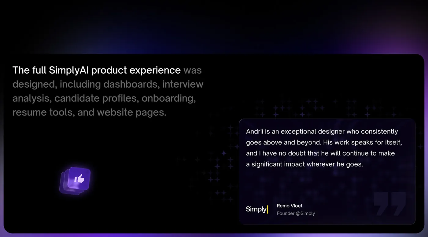
What was delivered, and what the founder said about it.
Working on something similar? Book a call
