What Splashup is
Splashup is a retail tech startup in Sydney, Australia. Its mission, as the project board puts it, is to build a leading network of online merchants that offers global and local post-transaction shopping experiences (what a shopper sees after paying). I worked there as a user interface designer from 2022 to 2023. The Behance project, published in August 2024, shows the website design.
The brief
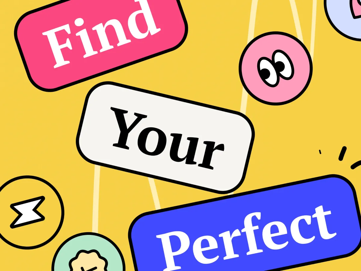
The main goal on the board: a website that reflects the innovative and creative spirit of Splashup through the Memphis visual style (bold geometric shapes and bright colors), with exceptional user friendliness and ease of use for visitors. The business value: attract a wide audience of global and local buyers.
My role
I was the user interface designer. My work there covered wireframes, prototypes and high-fidelity mockups, design systems and guidelines with responsive layouts, and user research and data analysis, working closely with development. This project shows the website design, in UI/UX and interaction design.
What I designed
- The look. Memphis shapes in a bright palette: blue as the main color, with pink, yellow and green accents. The type is PT Serif, with a plain sans for body text.
- 3D-style shapes. The board calls them 3D pseudo elements. They draw the eye to key points and appear in several sections.
- The home page. A hero that calls Splashup a fast-growing brand discovery network, with desktop and phone mockups. Then sections on growth, customer retention in 3 numbered steps, a set-up grid, customer comments, partner logos and a closing call to join the e-commerce movement.
- The mobile version. Phone screens carry the same story: keep shoppers engaged, reduce cart abandonment (shoppers leaving before they pay) and increase sales.
- A free demo offer. A ticket-style card invites visitors to get the demo for free.
Design decisions
- One style for the whole brand. Memphis gives a retail tech tool a creative, startup feel, and the same shapes and colors repeat through the page.
- Desktop and phone together. The hero already shows both, and the board has a set of phone screens.
- Short section titles. Titles like “Increase lead customer retention” and “Better return profit on a spend” say the benefit in a few words.
Outcome
The percentages inside the mockups are part of the website content, not measured results.
The full project
Every screen is on Behance. Tools: Figma, Adobe XD, Adobe Illustrator and Adobe Photoshop. For a longer website case, see Topdevs.
Working on something similar? Book a call
